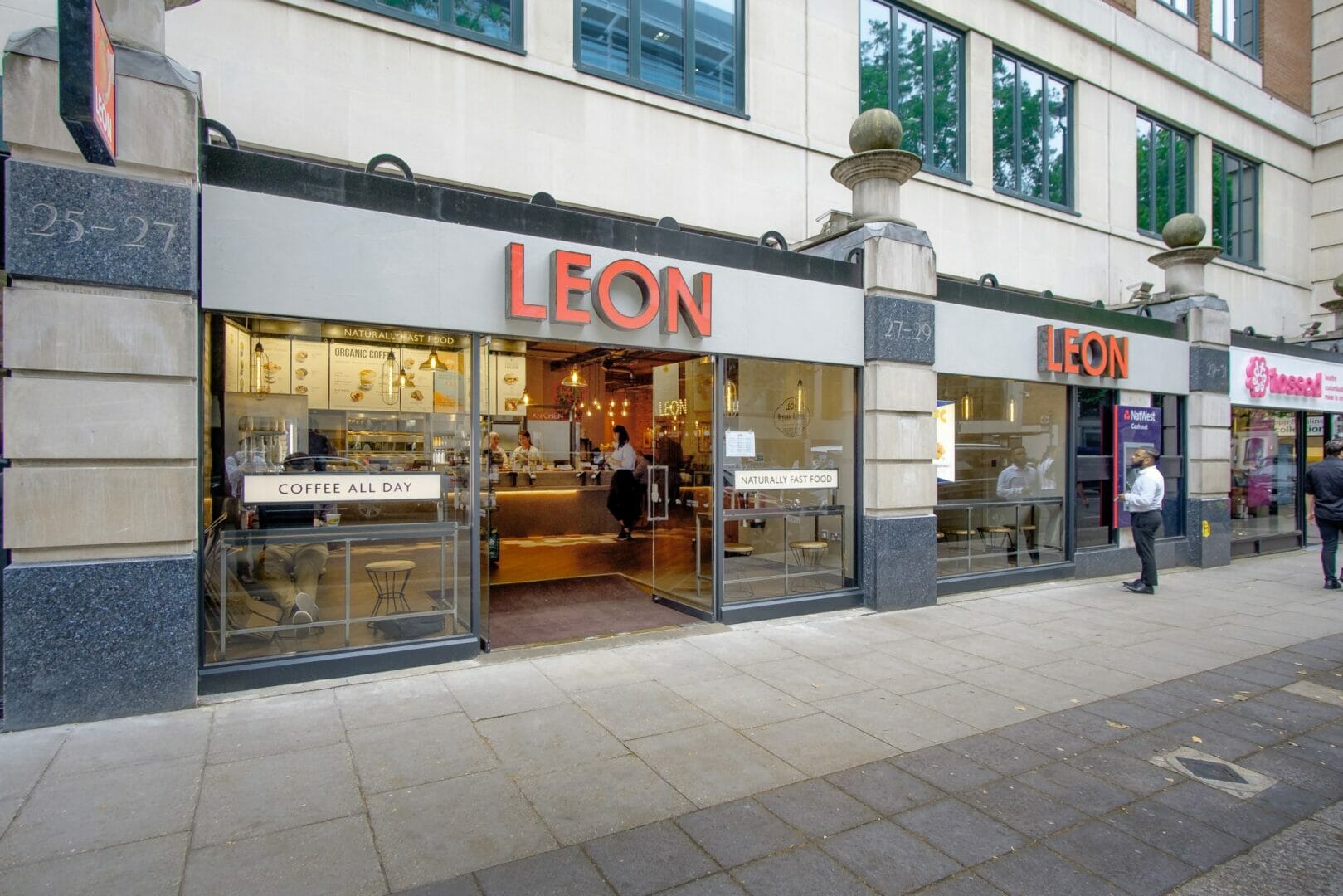
rpa:group has been working closely with healthy fast food brand Leon, on the delivery of a series of new restaurants in various European and UK locations. These include new restaurants in Oslo’s central rail station and Frognerveien district, as well as Utrecht in The Netherlands. Work is also underway on a new Leon restaurant opening soon in Rotterdam’s Central Station. In the UK, a new Leon restaurant has opened on London’s Horseferry Road, delivered by our Project Management division, as well as Centre Parcs in Woburn Forest.
The current expansion is largely as a result of collaborations between Leon and its franchise partners, which have helped extend the reach of this successful brand. Since it first opened its doors on Carnaby Street in London in 2004, Leon has grown into a chain of 59 restaurants across the UK, Scandanavia, Europe and the USA and received the accolade of “Best New Restaurant in Great Britain” in the Observer Food Monthly Awards.
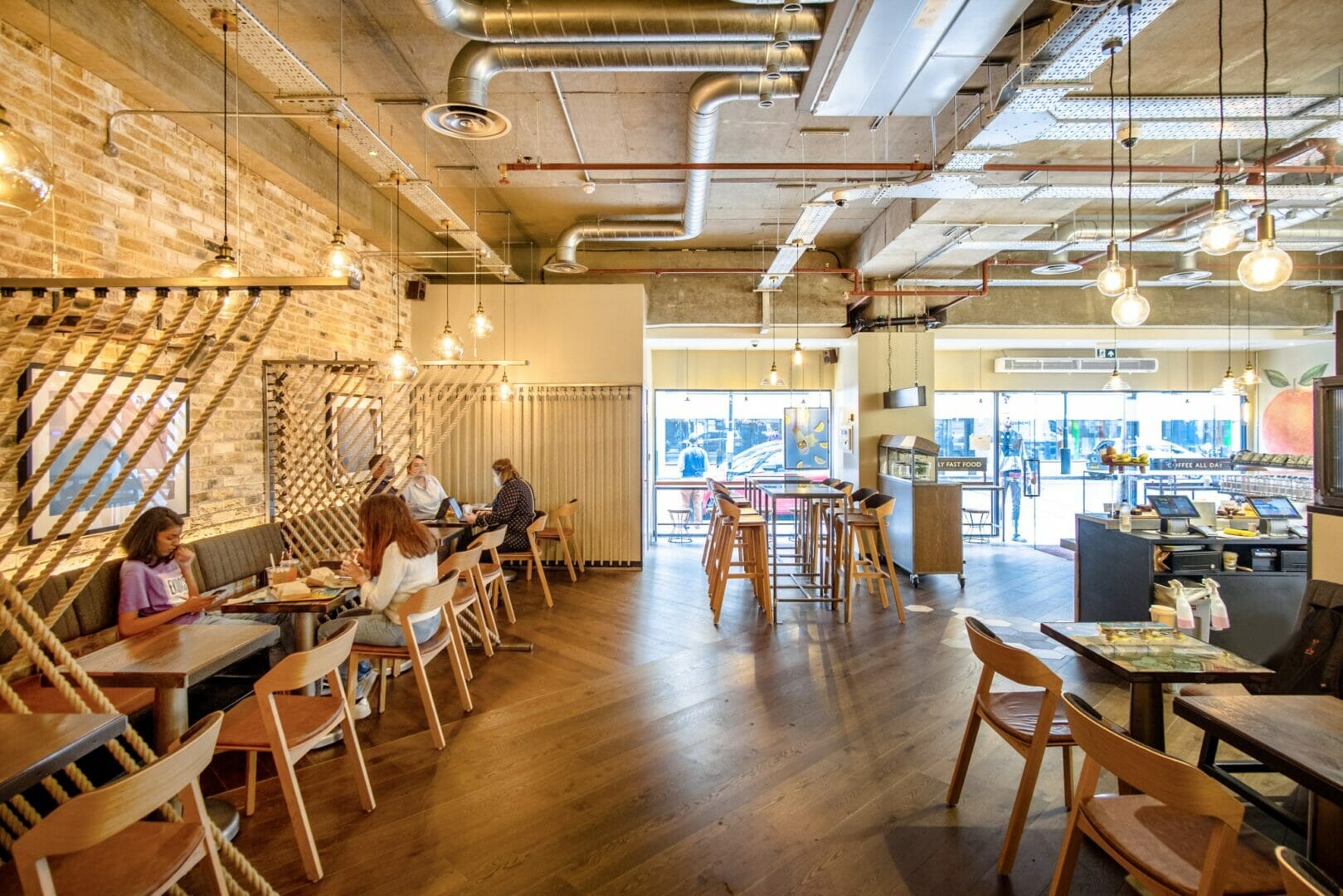
rpa:group’s Interior Architecture division has been working closely with Leon and their franchise partners on the design, customer flow analyses and layouts of the new restaurants. Acting as brand guardians, we have ensured that the complete design packages are consistent with Leon’s brand heritage.
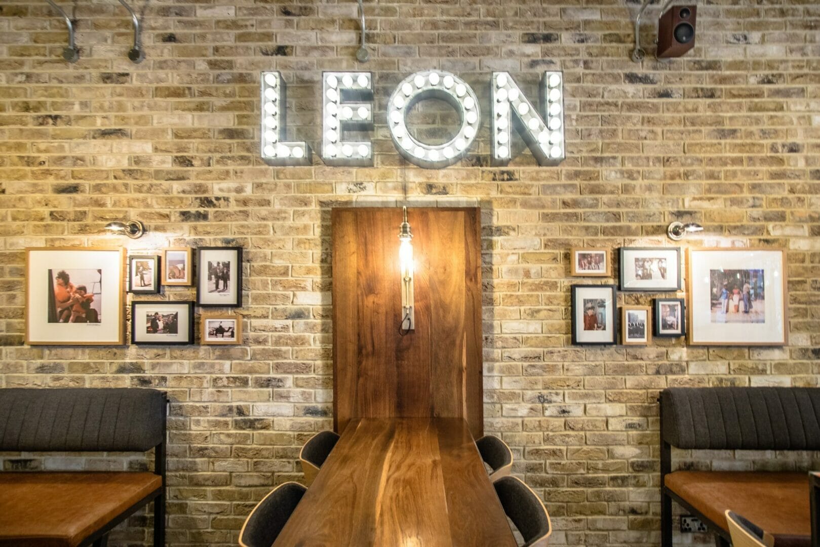
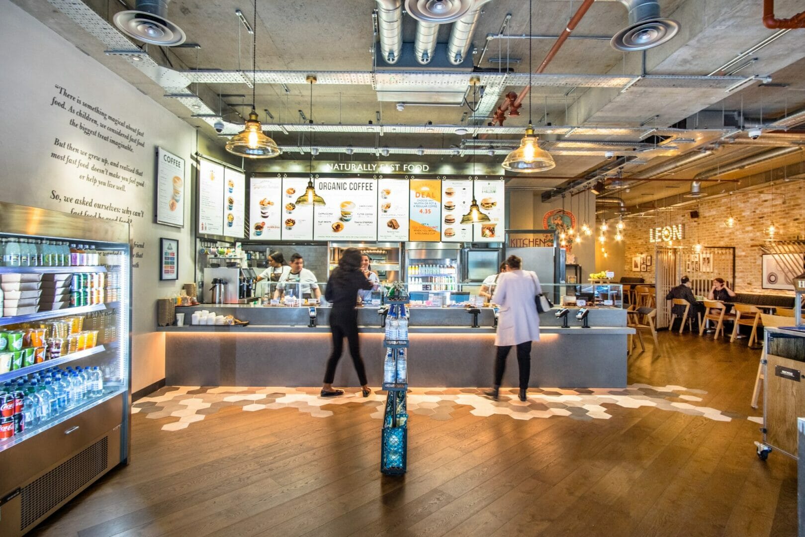
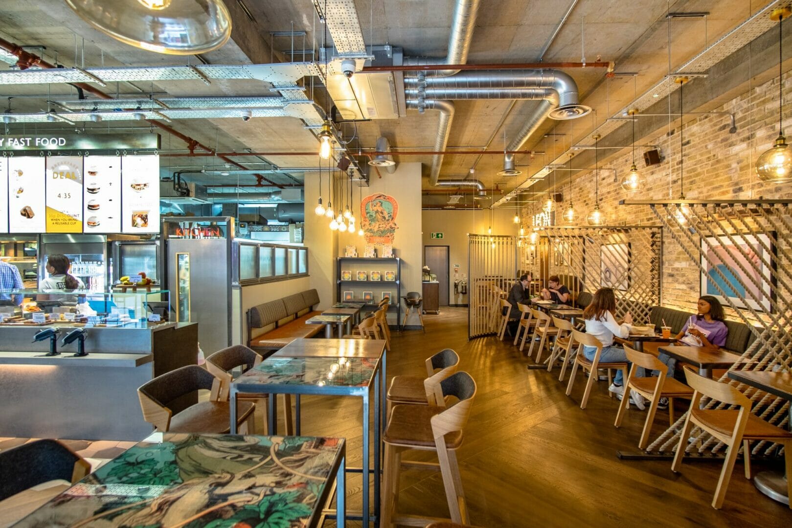
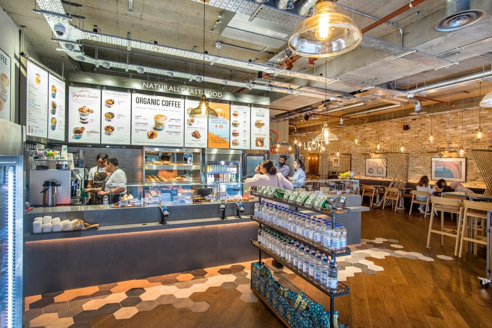
Although each restaurant aims to merge with its location, as if it has always been there, common design attributes are synonymous across all. These include bright, bold and beautiful interiors and the use of natural materials to reflect the wholesome quality of the food that is served. Materials, such as forest moss and baked oak, as well as planters with living plants help reflect this. Walls have a polished plaster finish in two tone and texture, to create a neutral and natural background, which make the graphics the main character.
Importantly, being neither rigid nor prescriptive with the design, allows for brand story telling and a flexibility to remain authentic and natural. However, what is inherent across all restaurants, is the classic brand imagery on the walls, such as the ‘LEON story’ and ‘Hand holding the orange’. This orange is used on all of Leon’s signage and is a paramount icon, as it signifies the natural ingredients in the food on offer.
As we become more health conscious as a society, there is further scope to deliver the Leon vision of providing fast food that is good food, to more customers across new locations in the future.

